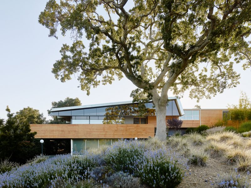
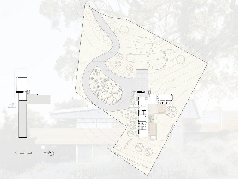
This project encompassed a renovation and addition to an existing mid-century hillside home in Silicon Valley. With incredible aspects and good bones, the home was promising yet poorly realized, and we set out to elevate it through a thoughtful and intuitive reworking.
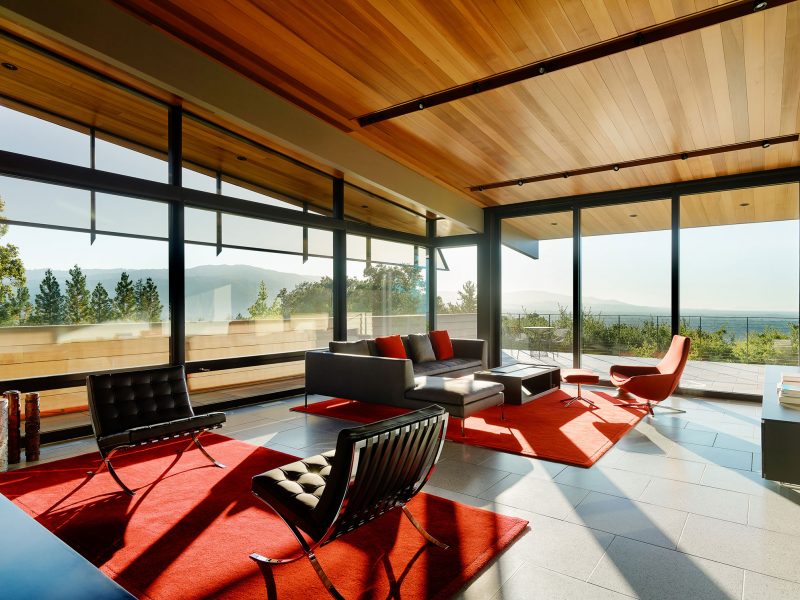
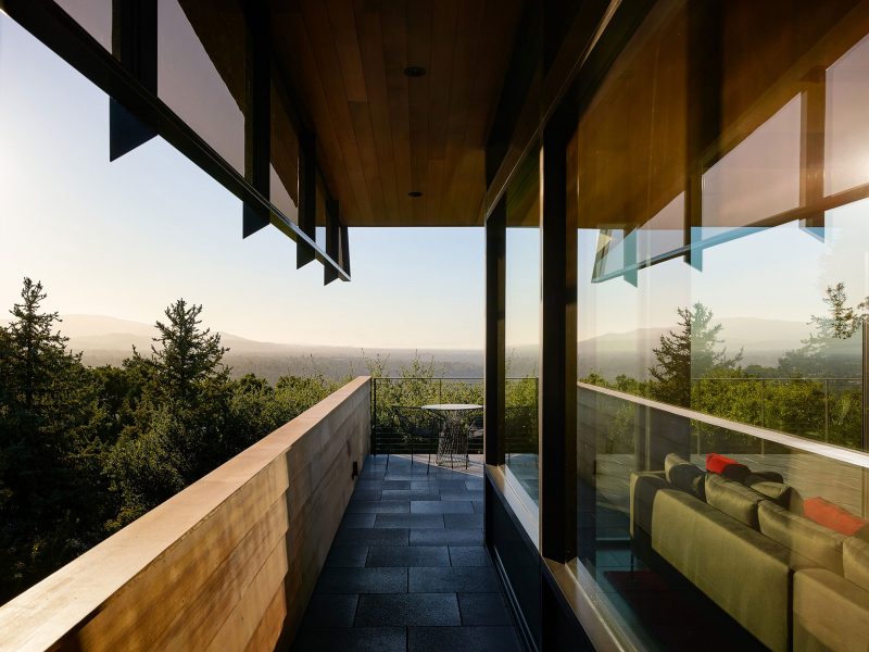
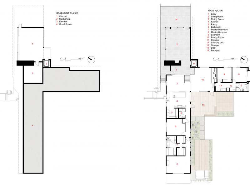
The existing form possessed many great qualities; we admired the audacity of the soaring roof shape and cantilevered deck, which would’ve been considered daring at the time, but ultimately the home lacked finesse in its materiality and flow. Consequently, we didn’t expand the envelope, except to add an elevator connecting the new garage to the main floor so that our clients could age in place, as well as enclose the open-air space below the main living area with an automated sliding glass door system. Alongside these additions, we focused on bringing cohesion to the design, leaning heavily on modern technology to create fluidity across the plan and improve thermal mass.
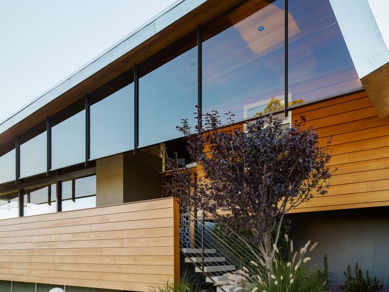
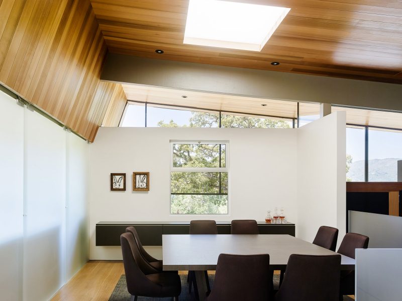
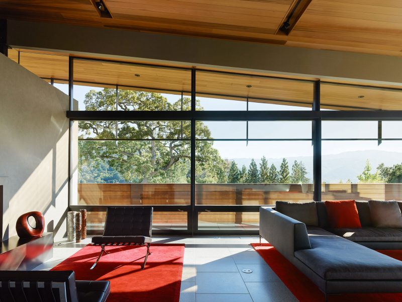
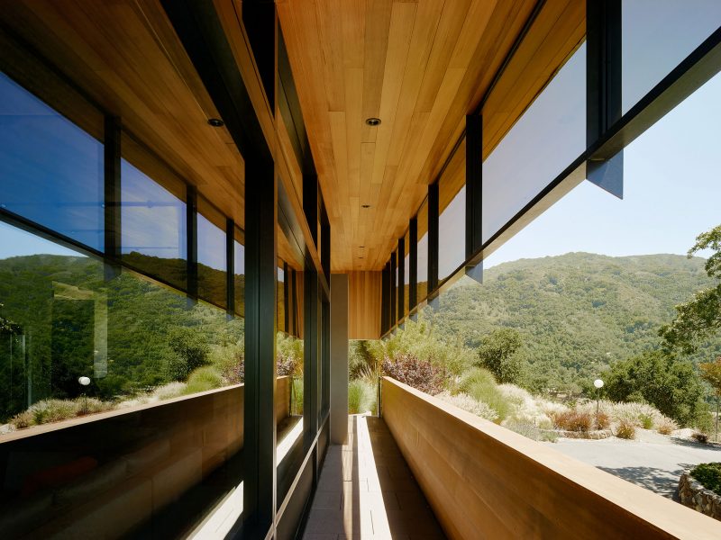
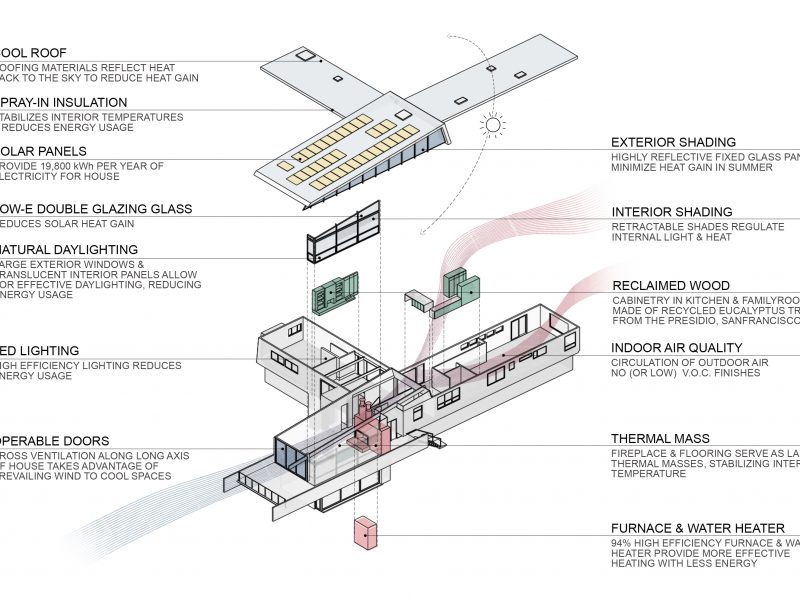
Unifying the exterior wall finishes was key to achieving a sense of harmony. Cedar siding now wraps the home, its horizontal arrangement enhancing the rectilinear nature of the form without adding visual cutter. Complemented by double low-E glazing and highly reflective fixed glass panels, which work to reduce solar heat gain, and enveloped by the surrounding vegetation, the form retains its modernist character with newfound subtlety.
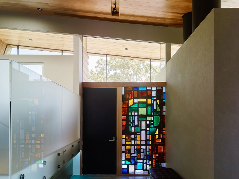
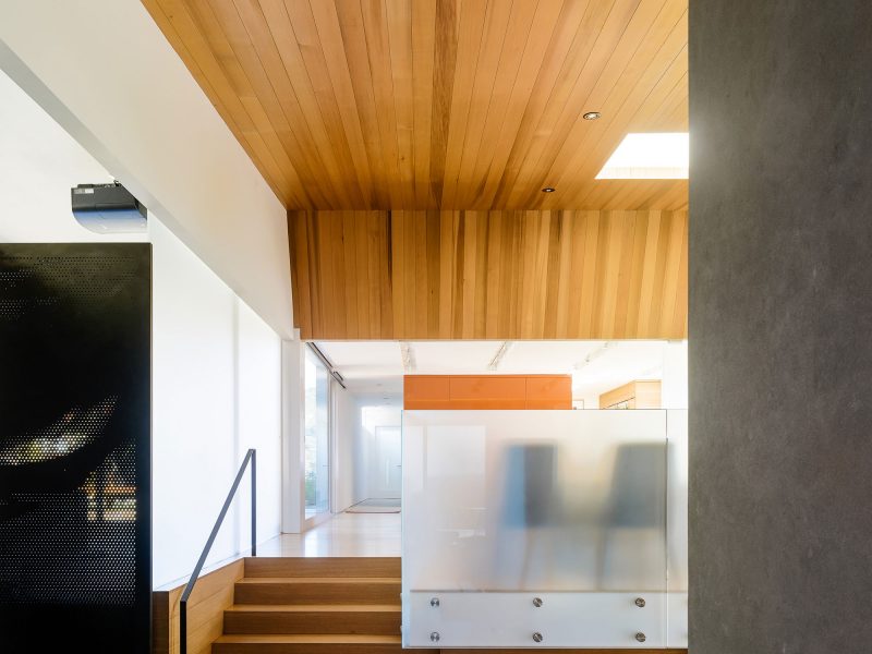
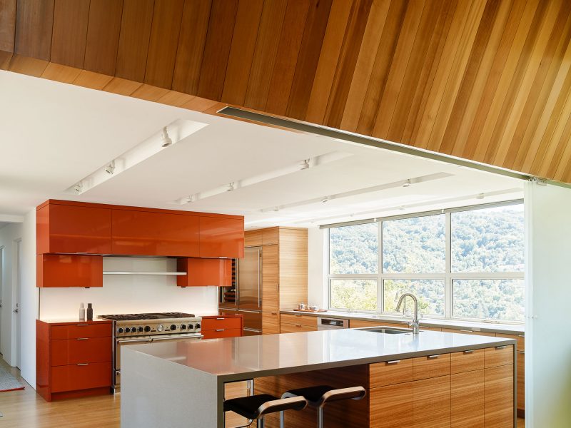
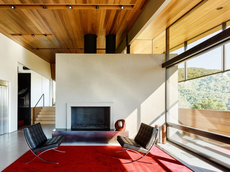
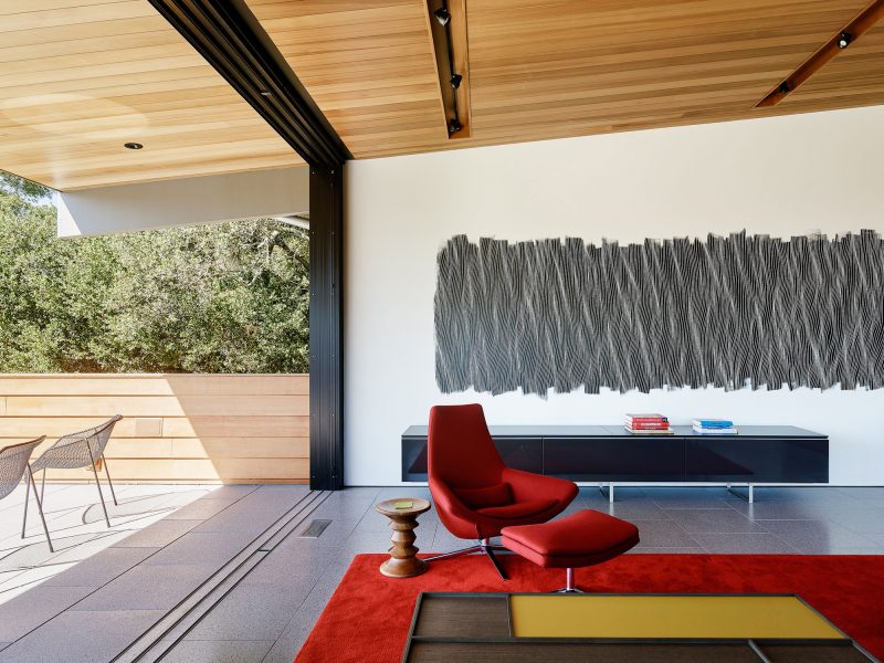
The interiors are similarly pared back with a palette of timber, glass and concrete. White oak flooring and cedar ceilings bring warmth, and cast concrete pavers in the living space and adjoining cantilevered terrace create continuity between indoor and out. There are bright and playful moments, too, thanks to sporadic injections of colour. Firstly, the full height cast glass entry window which is an important original feature. Comprising an abstract geometry of glass in shades of red, blue, green and yellow, it’s a fine example of art and craft in architecture and a rare decorative element we were determined to retain. Further, in the kitchen, burnt orange lacquered cabinets pick up the warm tones of the reclaimed Eucalyptus veneer felled at the Presidio in San Francisco, making for a feature both punchy and visually easy to digest.
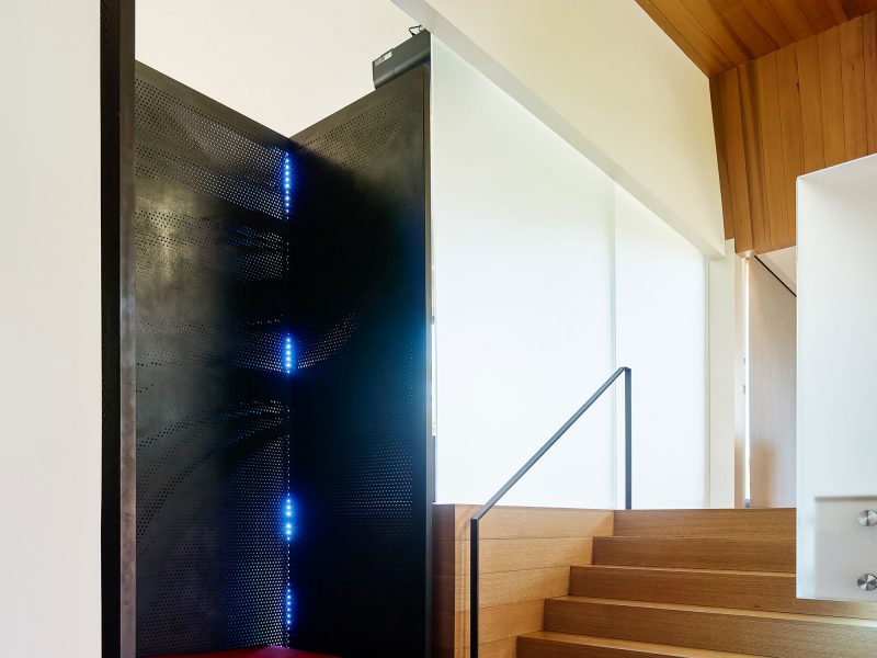
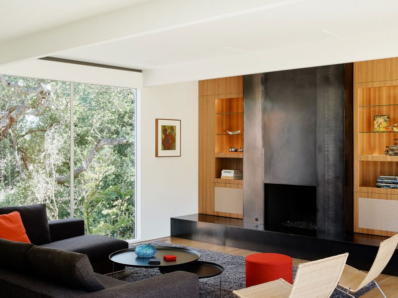
We also incorporated cold rolled steel as a foil to the earthiness of the timber. In the entry, full-height sheets of steel with a water jet cut perforated wave pattern and adjustable hued LED lamps – conceived as a modern nod to the original cast glass entry window – encase a low seat, providing a moment to pause or remove your shoes. The wave theme is echoed in the in-situ painting by Momoko Sudo in the living room. Also, steel reappears here as the fireplace surround, this time hot-rolled and with naturally-occurring fabrication marks.
Many of these custom and artfully conceived details were influenced by our clients – two seasoned technology founders with a no-nonsense style and a love of mid-century architecture. Their interest in modern technology, well-made furnishings and industrial design surely enriched our response, and it was incredibly fulfilling to explore their many varied affinities through the built form.


