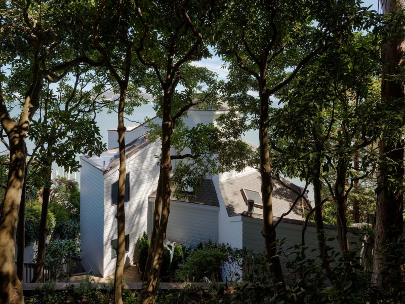
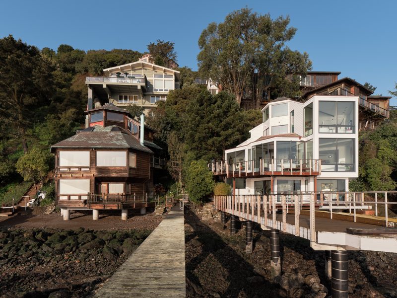
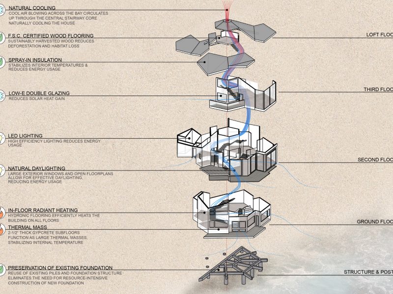
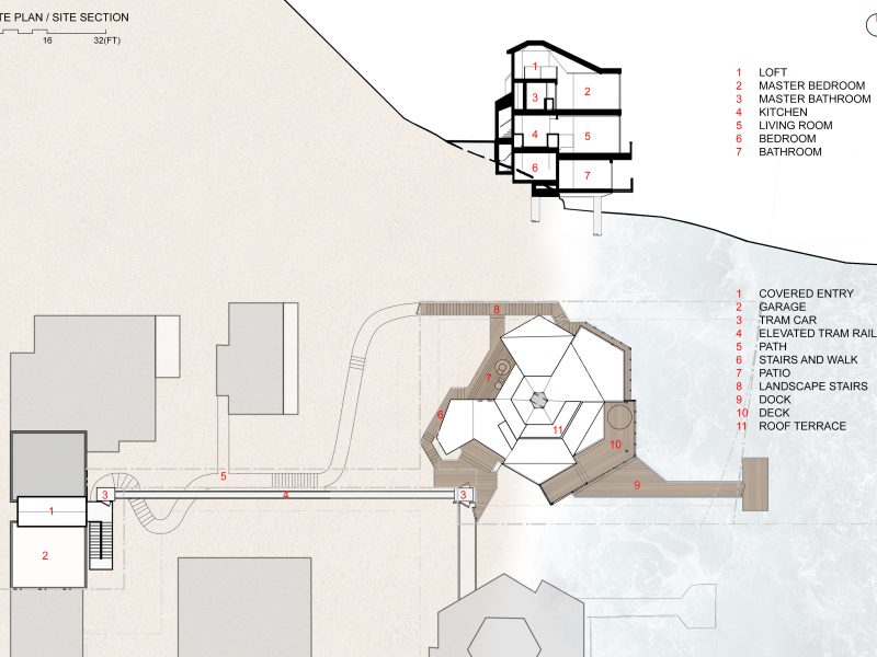
Lighthouse is a single-family residence at the foot of a hill overhanging the San Francisco Bay. With views to Angel Island and Alcatraz Island, the waterfront Sausalito home held great appeal to us and our clients, and maintaining its essence guided our design response alongside a pursuit for increased openness and light.
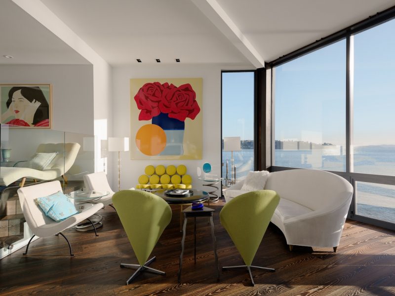
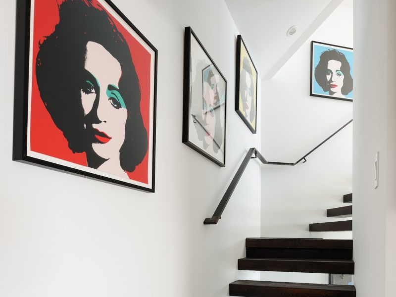
Our clients, a New York–based couple, had previously lived in a Sausalito home designed by our firm. Given this familiarity, they engaged us to introduce a sense of artistry and intention to their next home, Lighthouse. As avid collectors and keen supporters of the arts, their brief outlined a dramatic place to live amongst their treasured pieces when visiting from Manhattan.
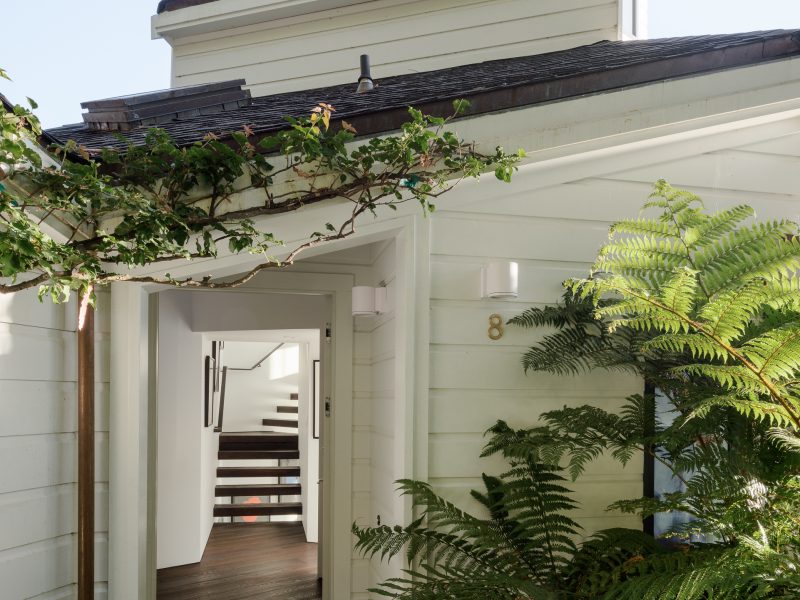
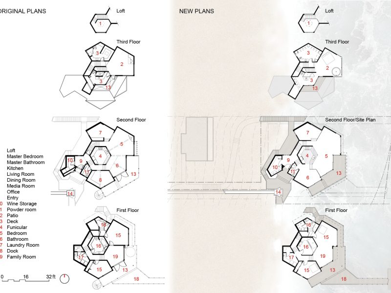
The existing dwelling is uniquely northern Californian, drawing on a variety of influences including the local self-built houseboats and alternative homes typical of the 1960s and 70s. Designed by local architect Kirk Hillman in the mid-1980s, it is one of a pair of unusual houses perched at the water’s edge, dubbed Lighthouse I and Lighthouse II. Our clients were drawn to the latter for its unrivalled siting and distinctive character, particularly its intricately designed hexagonal floorplan that pinwheels upwards three levels to a crow’s nest.
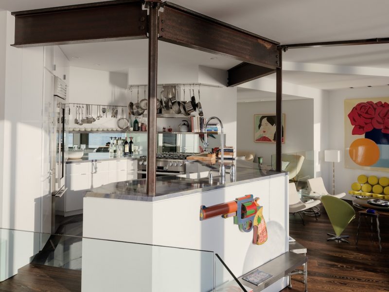
Given the home’s location in a seismically active zone, we replaced the existing timber frame with structural steel – a process that required significant consultation with a structural engineer. Another notable challenge pertained to the steep topography and limited site access. One of the area’s quintessential tram cars ferries the residents and their visitors to and from street level, however, an alternative method was required for construction traffic. The answer lay in a barge which transported all materials and finishes including timber, steel, concrete and all demolition debris to and from the site via its private dock.
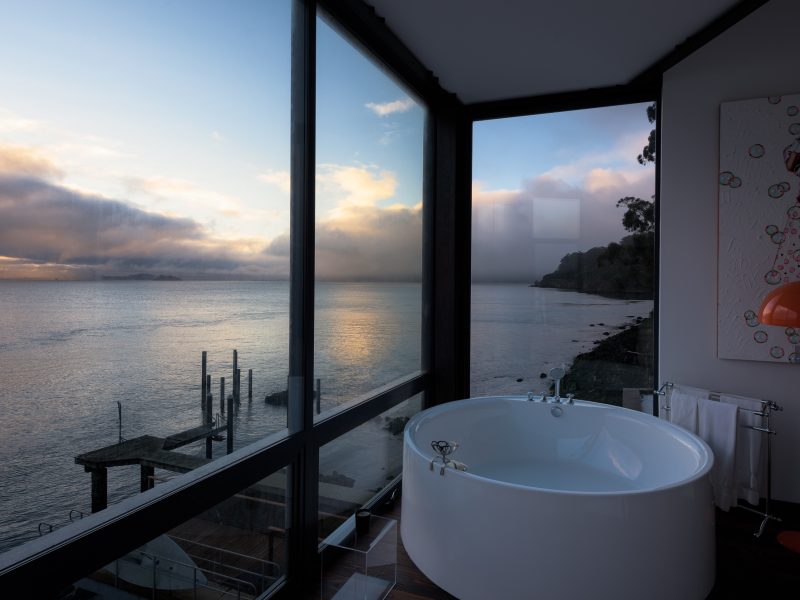
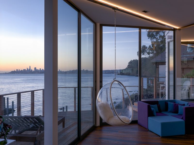
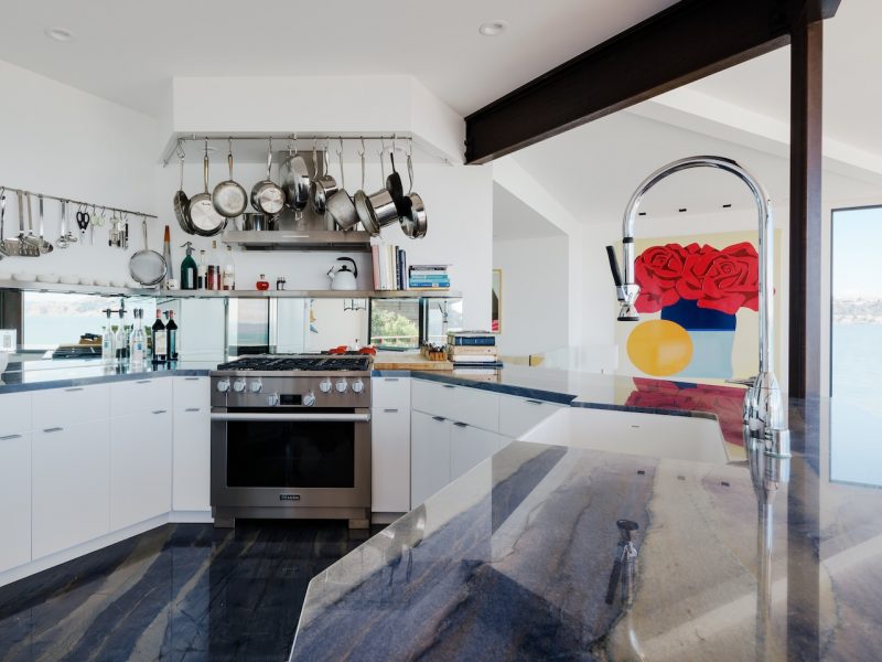
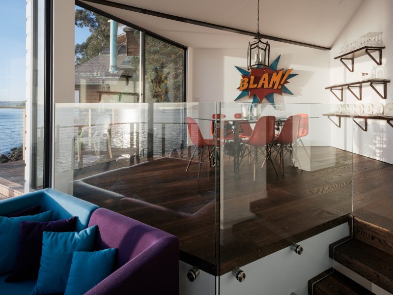
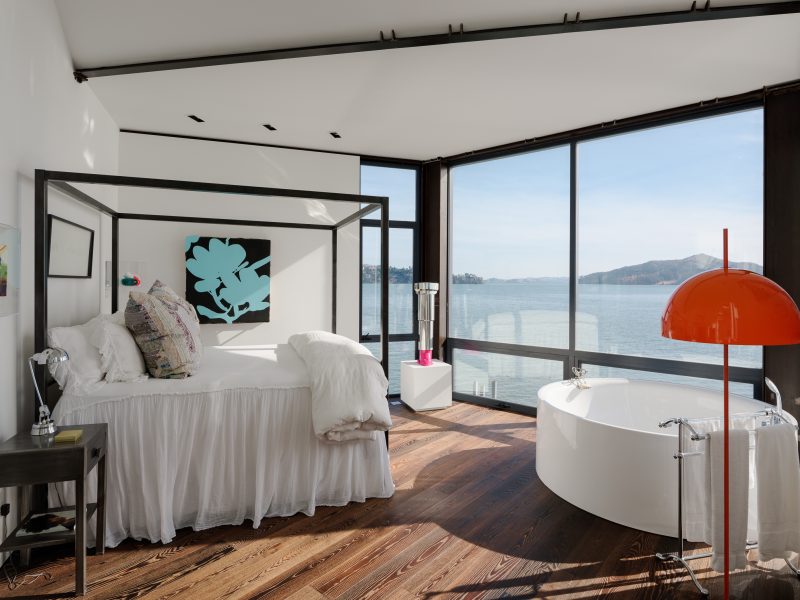
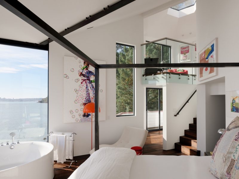
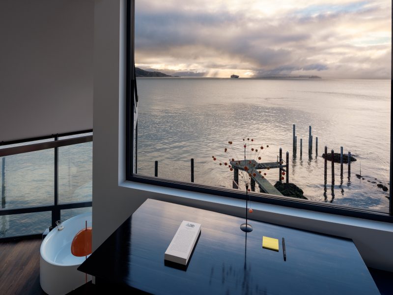
Inside, the home retains its offbeat charm through the jagged floor plan and changing ceiling heights. We were determined to celebrate its quirkiness however, the roof configuration limited the size and location of picture windows, and several interior walls obstructed views. As a result, we removed a series of walls to allow for a more fluid layout and raised the eaves to create space for floor-to-ceiling windows which capture generous aspects to the water and San Francisco’s skyline in the distance.
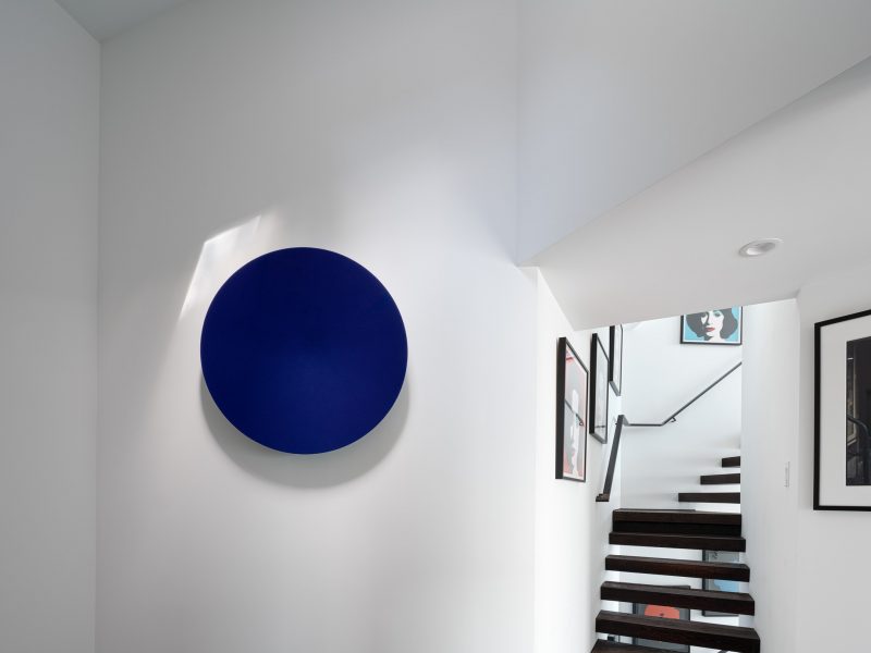
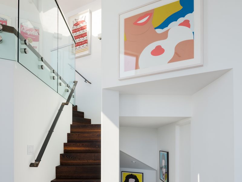
The new steel frame is exposed in places, introducing an element of industrial cool, and our clients’ dynamic collection of modern art and mid-century furniture brings a vibrant energy. We believe the most powerful upshot, however, is this home’s newfound sense of light and aspect – a notion that not only invigorates the everyday experience of Lighthouse but makes sense of its desirable location.


