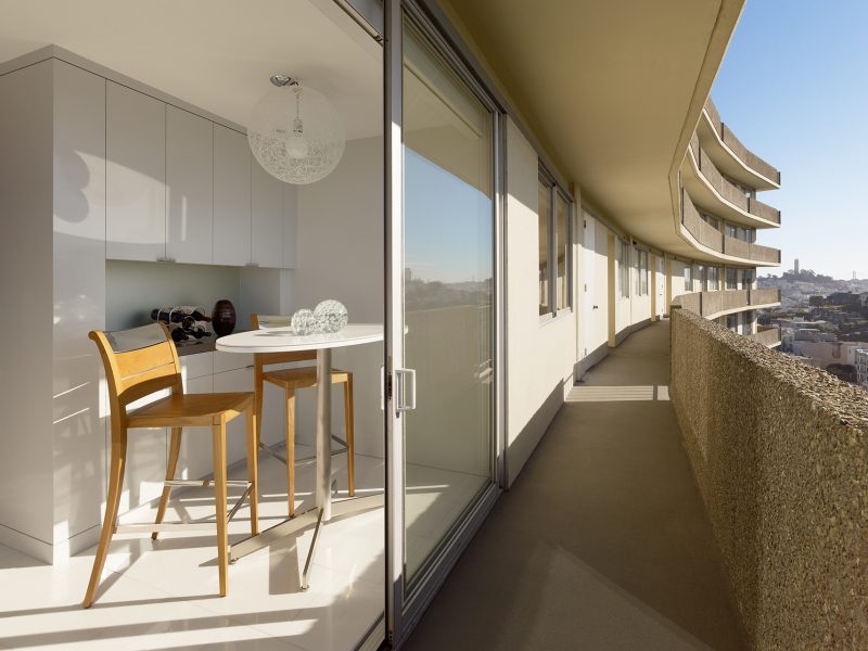
This striking project exudes a sort of clandestine sensuality. Located in the Fontana Apartment Towers on the San Francisco waterfront with sweeping views of the Golden Gate Bridge and Bay Bridge, the apartment’s aspect alone is captivating. However, it was the brief from our clients – a couple from the East Bay – for a private pied-à-terre (not even their adult children were made aware of this secretive city pad) that really captured our imagination.
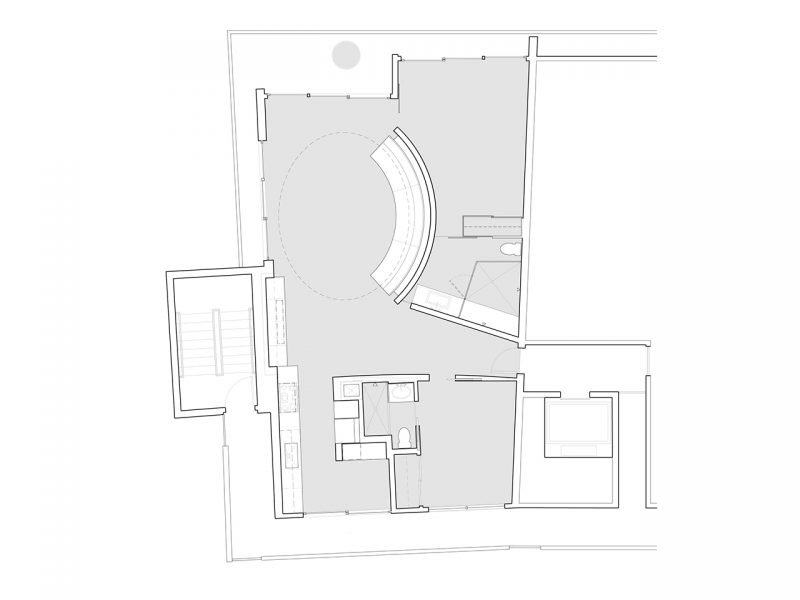
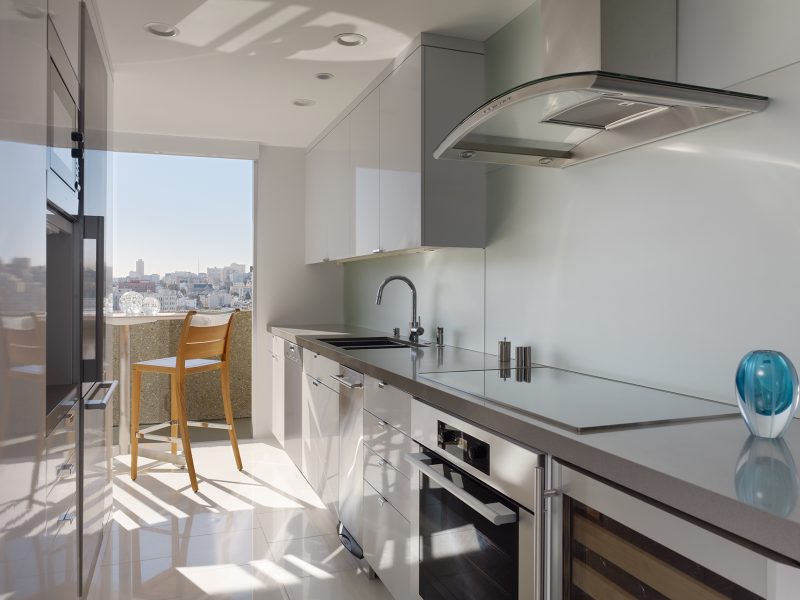
The existing apartment was untouched since its completion in the 1960s and our scope, which was realized in collaboration with interior designer Gary Hutton, involved completely reimagining the space. Removing all non-bearing walls and relocating services allowed us to reorient the floor plan towards the views and create a newly defined spatial sequence. We also played with loose delineation and lightness of form to introduce a sense of fluidity.
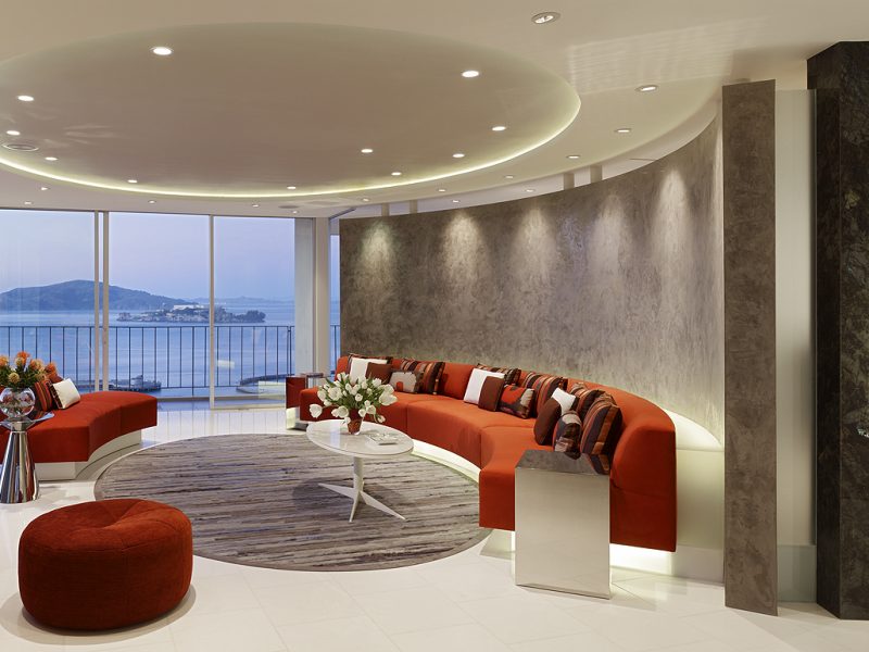
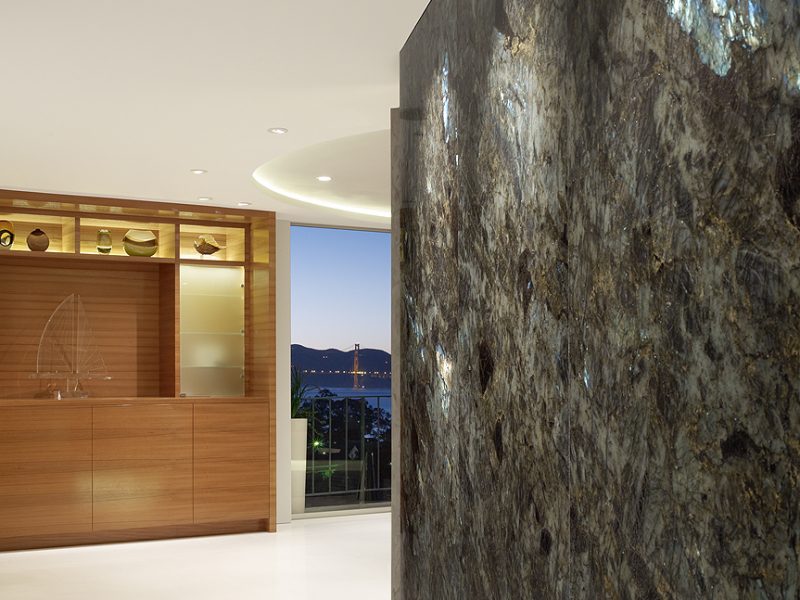
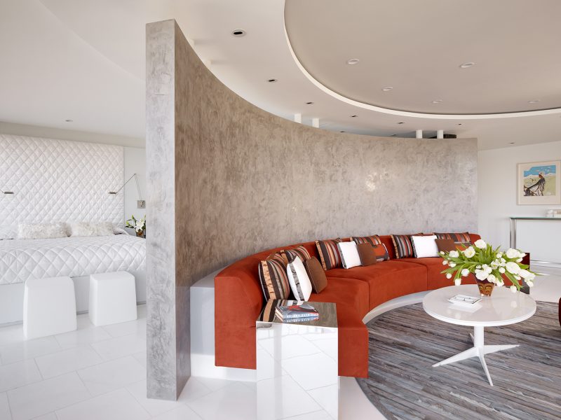
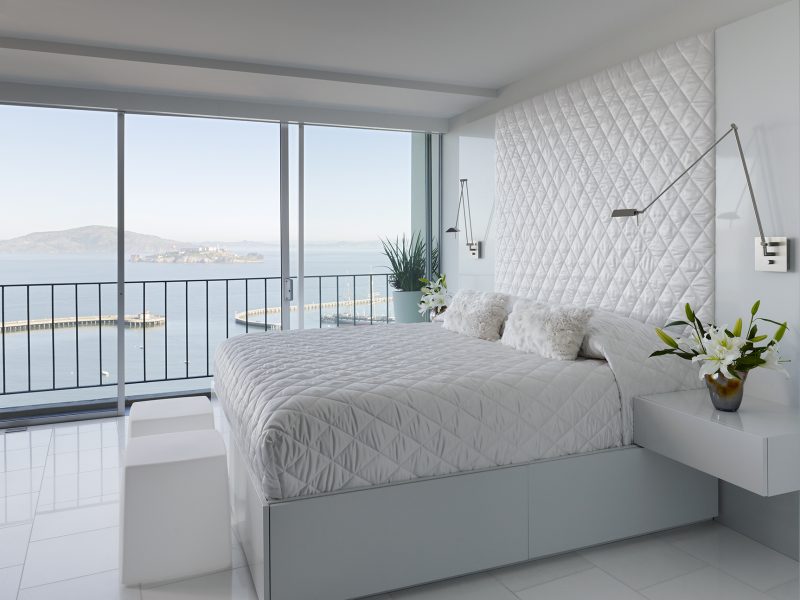
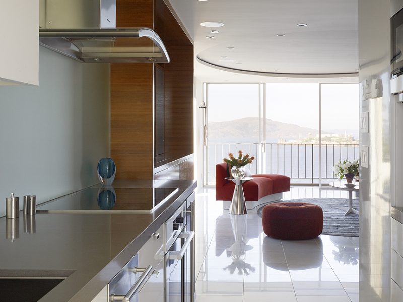
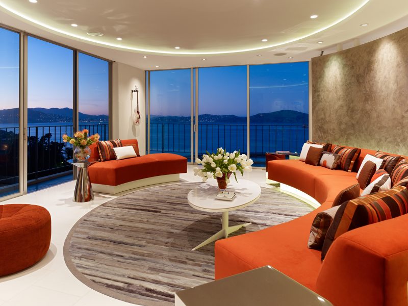
Our primary compositional moves include a new flared entry wall which serves to direct the view to the Golden Gate Bridge upon entering the apartment. Opening up like a funnel, this sequence naturally draws people into the living room, which unfurls to the right. The built-in sofa, encased in a semi-circular partition wall and oriented towards floor-to-ceiling glazing, is the perfect spot to sit and watch the boats sail by. Notably, the partition wall stops just shy of the ceiling, an effect that softens the sense of demarcation between the living room and the primary suite it bounds.
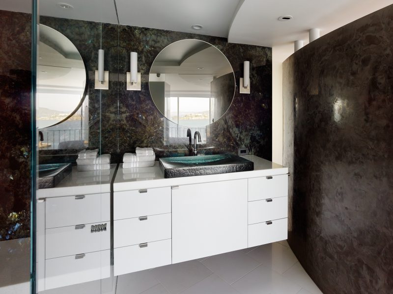
Our clients’ affinity for boating, seaside tropes and nautical materials can all be seen in the design rationale and materiality. Teak, which is found in various built-in and loose elements throughout the apartment, evokes a maritime feel, and the sweep of the arched wall and seating amplify the curving bay breakwater and main cables of the bridge in the distance. Offsetting the teak is the Labradorite granite which clads the entry wall; its iridescence accentuates the size of the apartment and creates a sleek and glimmering surface in keeping with this project’s chic overtones.
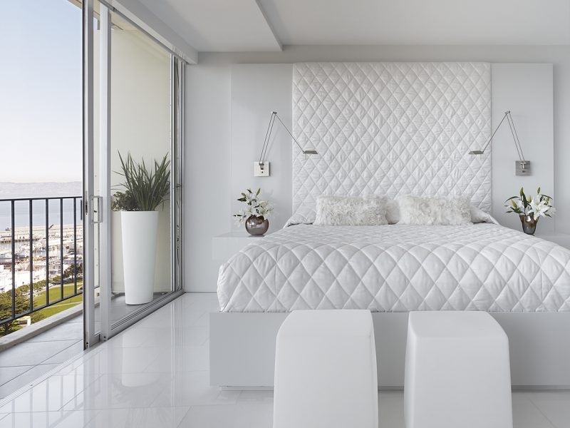
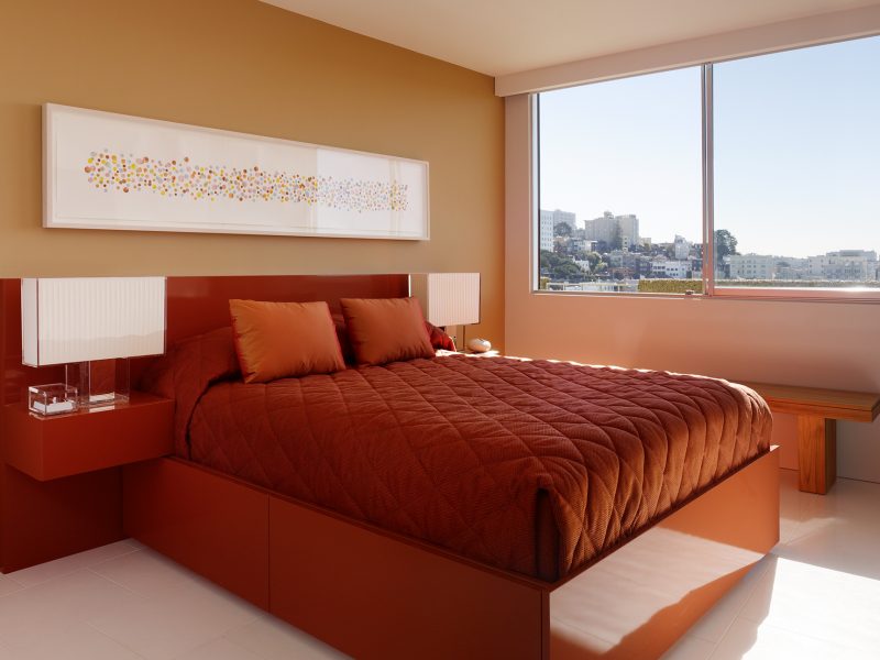
The primary palette of white and red with touches of grey is intended to be neutral in contrast to the ever-changing quality of light that dances around the interior. More specifically, red is an intentional nod to the city’s iconic bridge, and the white marble flooring and Venetian plaster speak to the brief for a high-end, resort-style getaway which, despite its urban setting, is the prevailing feeling of this secluded and luxurious dwelling. We admired our clients for conceiving a space for themselves and no one else, and imagine it has served them well as a place of pure escapism.
.


