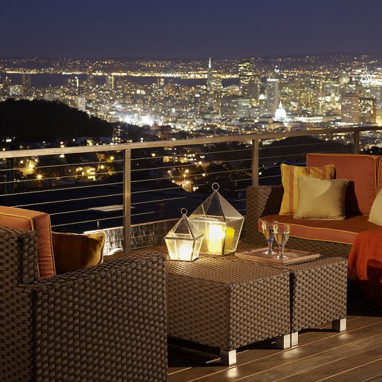
Our client, Geoffrey De Sousa – an interior designer and co-owner of the design showroom De Sousa Hughes – was drawn to this property for its location on one of the highest residential streets in San Francisco and panoramic views of the city. That said, the tired, 1930s-era Monterey-style home failed to do its context justice, and we worked alongside Geoffrey to open it up and introduce a contemporary edge.
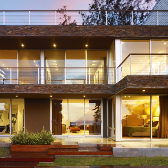
The original home contained only two bedrooms, a modest kitchen and dining area, a living room and a semi-developed lower level. Our scope involved extending the footprint on the lower two levels to the north by 25 feet, which allowed for a generous north-facing roof terrace adjoining the primary suite, as well as a library space, new dining room and breakfast nook on the main floor. At the lower level, a combination of the extension and some excavation allowed for a new guest suite, a family room, a second guest bedroom which doubles as a home gym, and a terrace – all of which benefit from increased ceiling heights.
The resulting generosity of space matches the home’s impressive location. What’s more, this expansive footprint and fluidity of programming has allowed Geoffrey to host large groups of friends and family over the years, and entertain with ease. Another integral element of our design response focused on opening up the plan to wholly embrace the views to the north of downtown San Francisco, the Golden Gate Bridge and Marin County. We achieved this through the use of new structural steel frames which replaced most of the existing transverse walls and created space for full height glazing along the rear elevation.
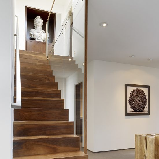
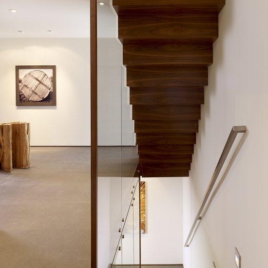
We also opened up the stairway with a two-story glass wall which allows natural light to travel down to the lower level, brightening up the rooms set deep into the plan. The stair has become one of this home’s defining features and one of the elements we’re most proud of; though modest in scale, it’s highly sculptural and transforms the human experience of this place.
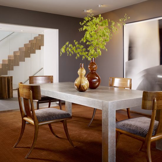
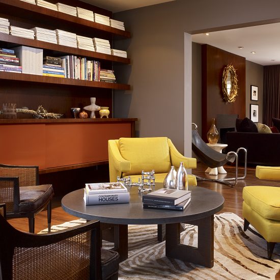
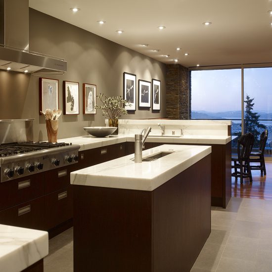
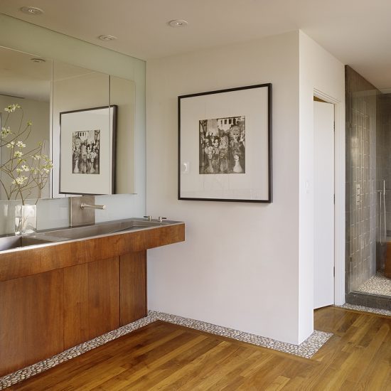
As well as the floorplan, the existing materiality required significant attention. Thanks to our close collaboration with Geoffrey, the interior and exterior material palettes evolved simultaneously, gleaning a cohesive response. Deep chocolate-colored stucco render wraps the home’s exterior, setting the warm and enveloping tone, and inside, we replaced bright yellow painted walls, heavy wood paneling and marble floors with light grey porcelain tiles, walnut flooring and Calacatta marble countertops.
Given Geoffrey’s aptitude for design, we had high hopes for the level of finesse and artistry that would permeate these walls. Pleasingly, the architecture, interiors and furnishings – such as contemporary photography, sculpture and vintage and new pieces – enjoy an effortless dialogue, and the resulting home is a sanctuary high above San Francisco’s urban buzz.


